
[Python] Confusion Matrix 시각화
Confusion matrix를 사용해 분류 모델의 성능을 알아보자.
우선 confusion matix를 간단하게 설명하자면, 모델의 예측값과 결과값이 얼마나 일치하는지를 나타내는 표이다. 좌상단에서 우하단으로 가는 대각선의 값이 높을수록 예측을 잘 이루어졌다는 의미다.
confusion_matrix(y_true, y_pred)을 통해서 단순하게 결과값을 배열의 형태로 얻을 수 있지만, 여기서 좀 더 나아가 시각화까지 시도해보자! 🌈
#from sklearn.svm import SVC
from sklearn.model_selection import train_test_split
#from sklearn.metrics import accuracy_score

# 학습 데이터와 훈련 데이터 split
X_train, X_test, y_train, y_test = train_test_split(dataset, y, test_size = 0.2, random_state = 42, shuffle = True)

# confusion matrix
from sklearn.metrics import confusion_matrix, plot_confusion_matrix
import matplotlib.pyplot as plt

label=['anger', 'happiness', 'fear', 'sadness', 'neutral'] # 라벨 설정
plot = plot_confusion_matrix(clf, # 분류 모델
                             X_test_scaled, y_test, # 예측 데이터와 예측값의 정답(y_true)
                             display_labels=label, # 표에 표시할 labels
                             cmap=plt.cm.Blue, # 컬러맵(plt.cm.Reds, plt.cm.rainbow 등이 있음)
                             normalize=None) # 'true', 'pred', 'all' 중에서 지정 가능. default=None
plot.ax_.set_title('Confusion Matrix')
결과는 아래와 같다.
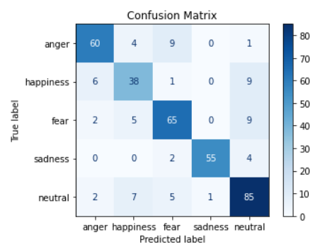
첫 번째 row를 보면 anger 데이터에 대해 anger라고 옳게 예측한 개수가 60개, [happiness, fear, sadness, neutral]이라고 예측한 경우, 즉 틀리게 예측한 경우가 각각 4, 9, 0, 1개라는 의미이다.
따라서 위에서 말한 것과 같이 대각선에 위치한 값이 높게 나와야 예측이 잘 된다고 볼 수 있다.
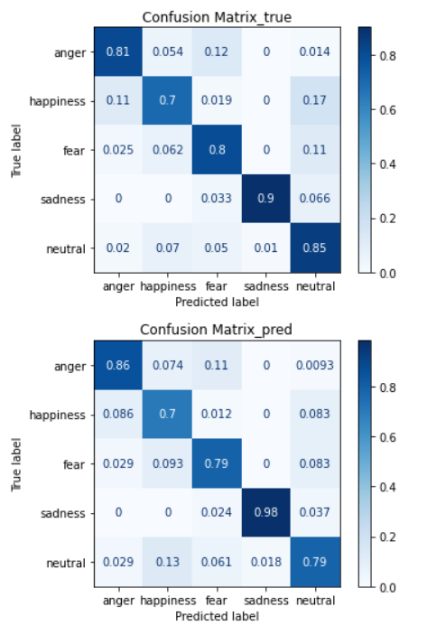
🎶 정규화
plot_confusion_matrix()의 인자 중에서, nomalize='true'로 설정하면 말 그대로 정규화를 할 수 있다. 위에서는 개수로 표현된 값이 좀 더 보기 편하게 퍼센트화 된다.
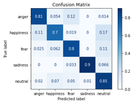
공식 문서를 참고하면, ‘true’는 row 기준, ‘pred’는 column기준으로 정규화 된다고 한다.
# 카테고리
- BOJ 36
- Algorithm 12
- CodingTest 11
- Web 9
- Javascript 8
- Vue 7
- React 7
- DBProject 4
- Python 3
- Tech-interview 3
- Express 3
- Next 3
- Github 2
- Django 2
- C 1
- C++ 1
- WebGame 1